Bootstrap Responsive Grid Structure
The number of mobile Internet users is increasing rapidly each year. The fast growing user base with smartphones forces companies to keep up with the age. therefore, day-by-day desktop PCs are becoming less popular and web applications are becoming mobile priority. When a web site is prepared, it may look fine on a desktop or laptop computer, but when you switch to mobile, but the same site may not look like it will please the visitor when the site gets opened in a mobile phone. Therefore, if we use a responsive theme, we can achieve a smooth look on mobile, tablet and laptop or desktop computers.
What does "Mobile First" mean?
In short, "Web technologies give priority to mobile devices, not to the computers." The fact that the design and code structure is in the priority mobile is also important for the satisfaction of the visitors who reach your page from the mobile.
If you say how to understand that a website is responsive; Open and minimize the Web site in any browser.Then reduce and increase the size. If the appearance of the site is different, that site is responsive. The screen sizes of the most commonly used devices that can establish an Internet connection are as follows: 320px (iPhone vertical hold), 480px (iPhone horizontal hold), 600px (Android Tablets), 768px (iPad + Galaxy Tablets) and 1024px (iPad side grip and desktop) ).
⦁ Extra small devices ~ Mobile (<768px) ~ col-xs-
⦁ Small devices ~ Tablet (> = 768px) ~ col-sm-
⦁ Medium devices ~ Computer (> = 992px) ~ col-md-
⦁ Large devices ~ Computer (> = 1200px) ~ col-lg-
Now let's code the grid structure with an example:
|
//Here,i opened a “div” that i will work with full screen page with “container-fluid”.
//with row,i said thats a line.in Bootstrap grid system,grids formed from 12 column.So,1 line has totally 12 columns.
//Now,here is the important part.as saying col-xs-4,we also mean saying that my page uses 4 column place in mobile.When we want to use in Tablets,using the col-sm-2,we scale it.And in Laptop or in Desktop PCs,we use col-md-2 col-lg-1.For making the columns salient,i put icon, and you can also write some texts instead of image.
//As you have noticed,i changed something here and i said that i dont want to see that “div” in mobile.i hid it with hidden-xs.
//i did same change here too and i said that i dont want to see that div in in mobile,in tablets and in little-screen PCs. İ hid them with hidden-xs in mobile,with hidden-sm in tabletsd and with hidden-md in little-screen PCs.
//here,to work on website with gaps on the sides of page,i opened a div.
//i opened a div as it will use full page in mobile and 4 columns in dektop pc.This is a column of the row that we opened.
Lorem ipsum dolor sit amet, consectetur adipisicing elit, sed do
eiusmod tempor incididunt ut labore et dolore magna aliqua. Ut
enim ad minim veniam, quis nostrud exercitation ullamco laboris
nisi ut aliquip ex ea commodo consequat.
Lorem ipsum dolor sit amet, consectetur adipisicing elit, sed do
eiusmod tempor incididunt ut labore et dolore magna aliqua. Ut
enim ad minim veniam, quis nostrud exercitation ullamco laboris
nisi ut aliquip ex ea commodo consequat.
Ut enim ad minim veniam, quis nostrud exercitation.
// i opened a div as it will use full page in mobile and 6 columns in dektop pc.we are still in same row.
//im placing 3 rows more in our column.
Lorem ipsum dolor sit amet, consectetur adipisicing elit, sed do
eiusmod tempor incididunt ut labore et dolore magna aliqua. Ut
enim ad minim.
Ut enim ad minim veniam, quis nostrud exercitation ullamco
laboris nisi ut aliquip ex ea commodo consequat.
Lorem ipsum dolor sit amet, consectetur adipisicing elit, sed do
eiusmod tempor incididunt ut labore et dolore magna aliqua. Ut
enim ad minim.
Lorem ipsum dolor sit amet, consectetur adipisicing elit, sed do
eiusmod tempor incididunt ut labore et dolore magna aliqua. Ut
enim ad minim veniam, quis nostrud exercitation ullamco laboris
nisi ut aliquip ex ea commodo consequat.Lorem ipsum dolor sit amet, consectetur adipisicing elit, sed do
eiusmod tempor incididunt.
//full page in mobile,2 columns in desktop pc.we are still in same row.
Lorem ipsum dolor sit amet, consectetur adipisicing elit, sed do
eiusmod tempor incididunt ut labore et dolore magna aliqua.
Ut enim ad minim veniam, quis nostrud exercitation ullamco laboris
nisi ut aliquip exe.Ut enim ad minim veniam.
//im opening a new row.
//i want to let it be full page in mobile and im dividing to 2 piece.
Lorem ipsum dolor sit amet, consectetur adipisicing elit, sed do eiusmod tempor incididunt ut labore et dolore magna aliqua. Utenim ad minim veniam, quis nostrud exercitation ullamco laboris nisi ut aliquip ex ea commodo consequat.
Lorem ipsum dolor sit amet, consectetur adipisicing elit, sed do eiusmod tempor incididunt ut labore et dolore magna aliqua. Utenim ad minim veniam, quis nostrud exercitation ullamco laboris nisi ut aliquip ex ea commodo consequat.Lorem ipsum dolor sit amet, consectetur adipisicing elit.
|
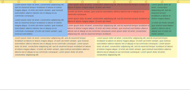
View from computer
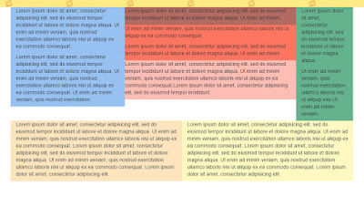
View from Tablet
View from phone
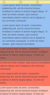
If you have noticed, there are 12 sheets on the computer, 6 sheets on the tablet and 3 sheets on the mobile. This is because we use hidden-xs, hidden-sm, and hidden-md classes. In addition, if a scrollbar at the bottom does not appear while you minimize the page and change the image on the screen shows that we are doing the right work.
Meryem Akdoğan
Portakal Yazılım